Branding
Siberian Secret Packs
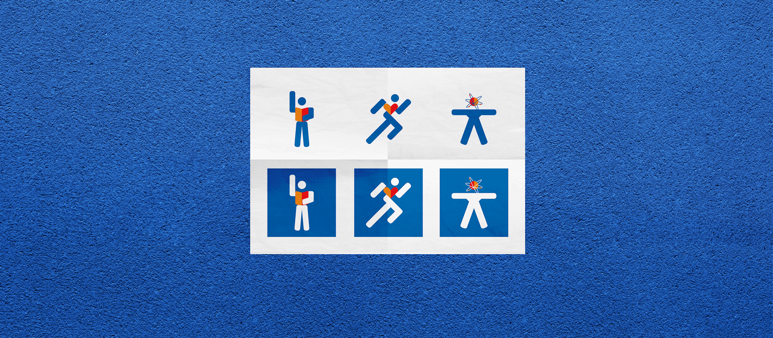
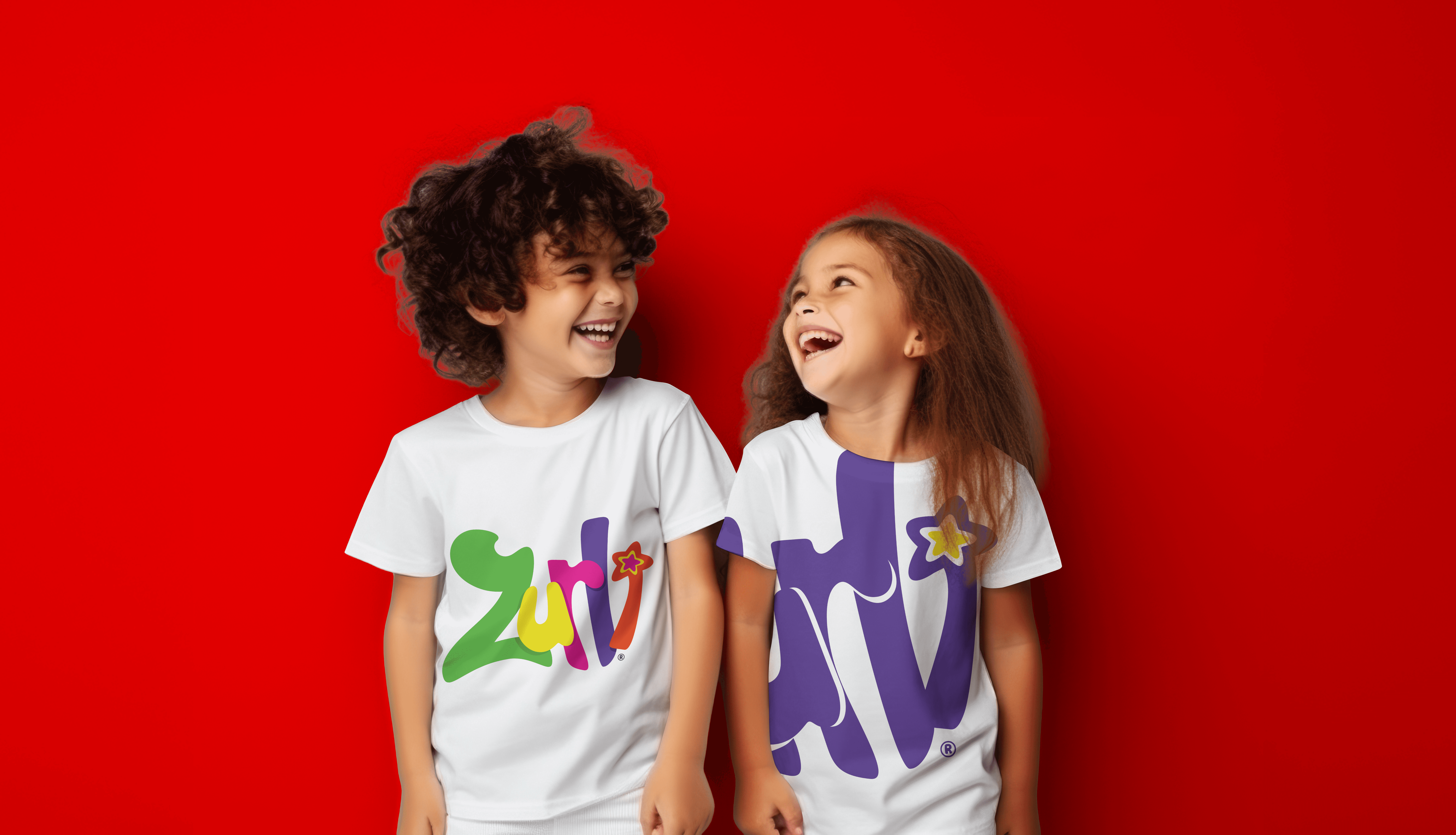
Branding, packaging, and landing page design for Siberian Secret—an energy syrup made for those mornings when “never drinking again” becomes today’s vibe. I crafted everything from scratch: logo, icons, pack design, and web visuals for four flavors. Think hangover recovery, but stylish.
Year :
2019
Industry :
Suplements
Client :
Europarus
Project Duration :
2 weeks

Problem :
Client had a great product (basically a post-party rescue syrup) but no visual identity—just a few screenshots of competitor stuff and a name: Siberian Secret. They needed someone to turn that into a real brand with personality, packaging, and web presence.
Solution :
I built everything from the ground up: logo, icon set, branding system, landing page, and packaging design—including single-dose slips, dispenser boxes, and retail-ready packs for all four flavors. Clean, bold, a little edgy—because if your head’s pounding, the design at least should make you smile.

Challenge :
Honestly? Nothing major. The only real challenge was adapting the design system across multiple packaging formats and sizes without losing consistency. It was more like design Tetris than creative combat—but I do love a good grid game.
Results:
The full package of branding and web visuals helped shelf presence and click-through—leading to a 12% increase in retail orders post-launch. Online landing page CTR reached 8%, well above industry average, and packaging feedback surveys showed 90% positive first impressions in consumer testing.
More Projects

Branding
Siberian Secret Packs
Branding, packaging, and landing page design for Siberian Secret—an energy syrup made for those mornings when “never drinking again” becomes today’s vibe. I crafted everything from scratch: logo, icons, pack design, and web visuals for four flavors. Think hangover recovery, but stylish.
Year :
2019
Industry :
Suplements
Client :
Europarus
Project Duration :
2 weeks
Problem :
Client had a great product (basically a post-party rescue syrup) but no visual identity—just a few screenshots of competitor stuff and a name: Siberian Secret. They needed someone to turn that into a real brand with personality, packaging, and web presence.
Solution :
I built everything from the ground up: logo, icon set, branding system, landing page, and packaging design—including single-dose slips, dispenser boxes, and retail-ready packs for all four flavors. Clean, bold, a little edgy—because if your head’s pounding, the design at least should make you smile.
Challenge :
Honestly? Nothing major. The only real challenge was adapting the design system across multiple packaging formats and sizes without losing consistency. It was more like design Tetris than creative combat—but I do love a good grid game.
Results:
The full package of branding and web visuals helped shelf presence and click-through—leading to a 12% increase in retail orders post-launch. Online landing page CTR reached 8%, well above industry average, and packaging feedback surveys showed 90% positive first impressions in consumer testing.
More Projects
Branding
Siberian Secret Packs
Branding, packaging, and landing page design for Siberian Secret—an energy syrup made for those mornings when “never drinking again” becomes today’s vibe. I crafted everything from scratch: logo, icons, pack design, and web visuals for four flavors. Think hangover recovery, but stylish.
Year :
2019
Industry :
Suplements
Client :
Europarus
Project Duration :
2 weeks
Problem :
Client had a great product (basically a post-party rescue syrup) but no visual identity—just a few screenshots of competitor stuff and a name: Siberian Secret. They needed someone to turn that into a real brand with personality, packaging, and web presence.
Solution :
I built everything from the ground up: logo, icon set, branding system, landing page, and packaging design—including single-dose slips, dispenser boxes, and retail-ready packs for all four flavors. Clean, bold, a little edgy—because if your head’s pounding, the design at least should make you smile.
Challenge :
Honestly? Nothing major. The only real challenge was adapting the design system across multiple packaging formats and sizes without losing consistency. It was more like design Tetris than creative combat—but I do love a good grid game.
Results:
The full package of branding and web visuals helped shelf presence and click-through—leading to a 12% increase in retail orders post-launch. Online landing page CTR reached 8%, well above industry average, and packaging feedback surveys showed 90% positive first impressions in consumer testing.