UI / UX Design
Memorial Landing Pages
Help desing new landing pages to add knowledge to potential customers so that they better understand procedures and interventions.
Year :
2024
Industry :
Medical
Client :
Memorial Hospital
Project Duration :
12 month
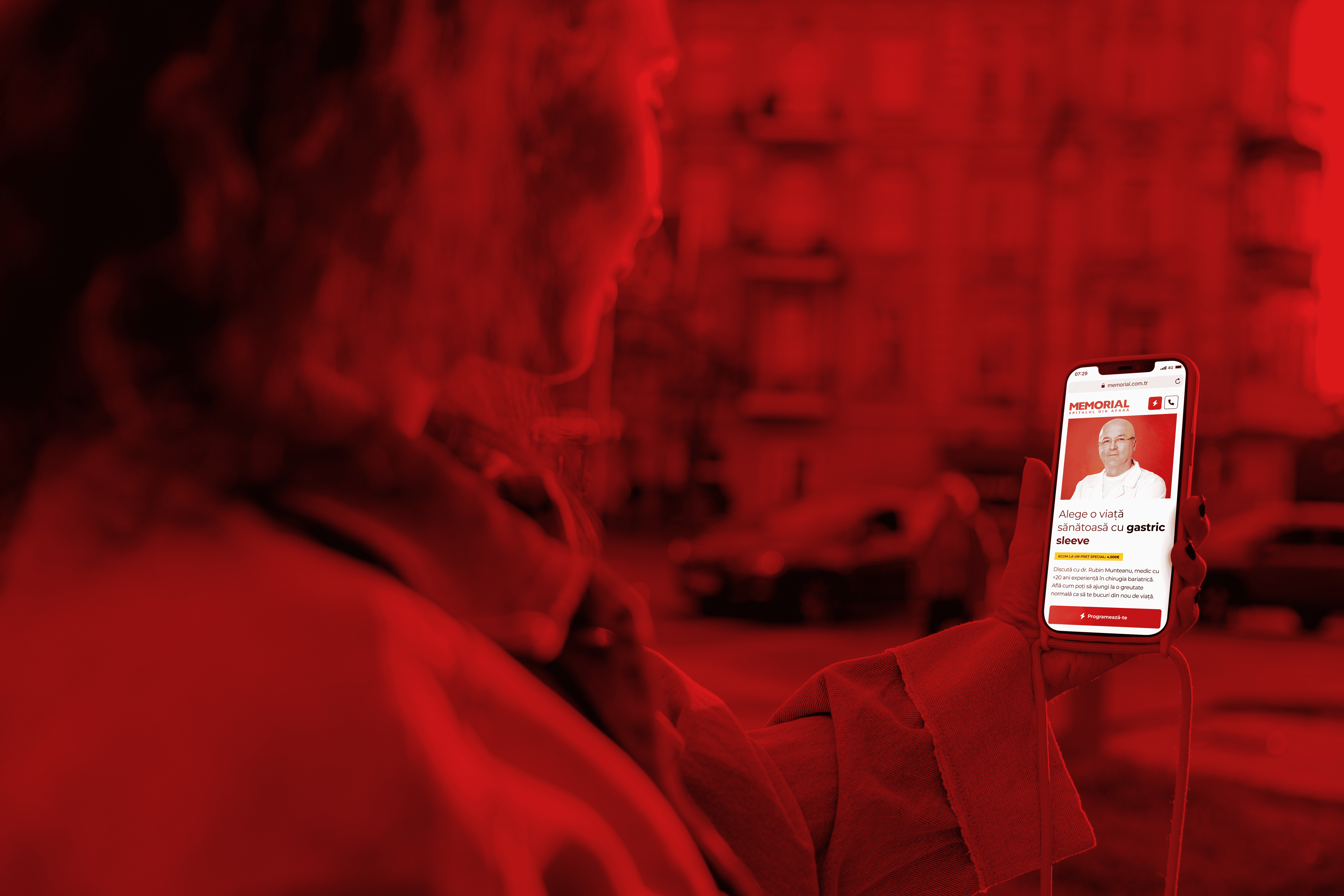
Problem :
Let’s be honest—medical procedures can be scary, and most hospital websites don’t exactly help. Memorial needed landing pages that didn’t feel like reading a user manual for your own spleen. Patients had no clue what half the interventions even meant, and that made booking an appointment harder than it needed to be.
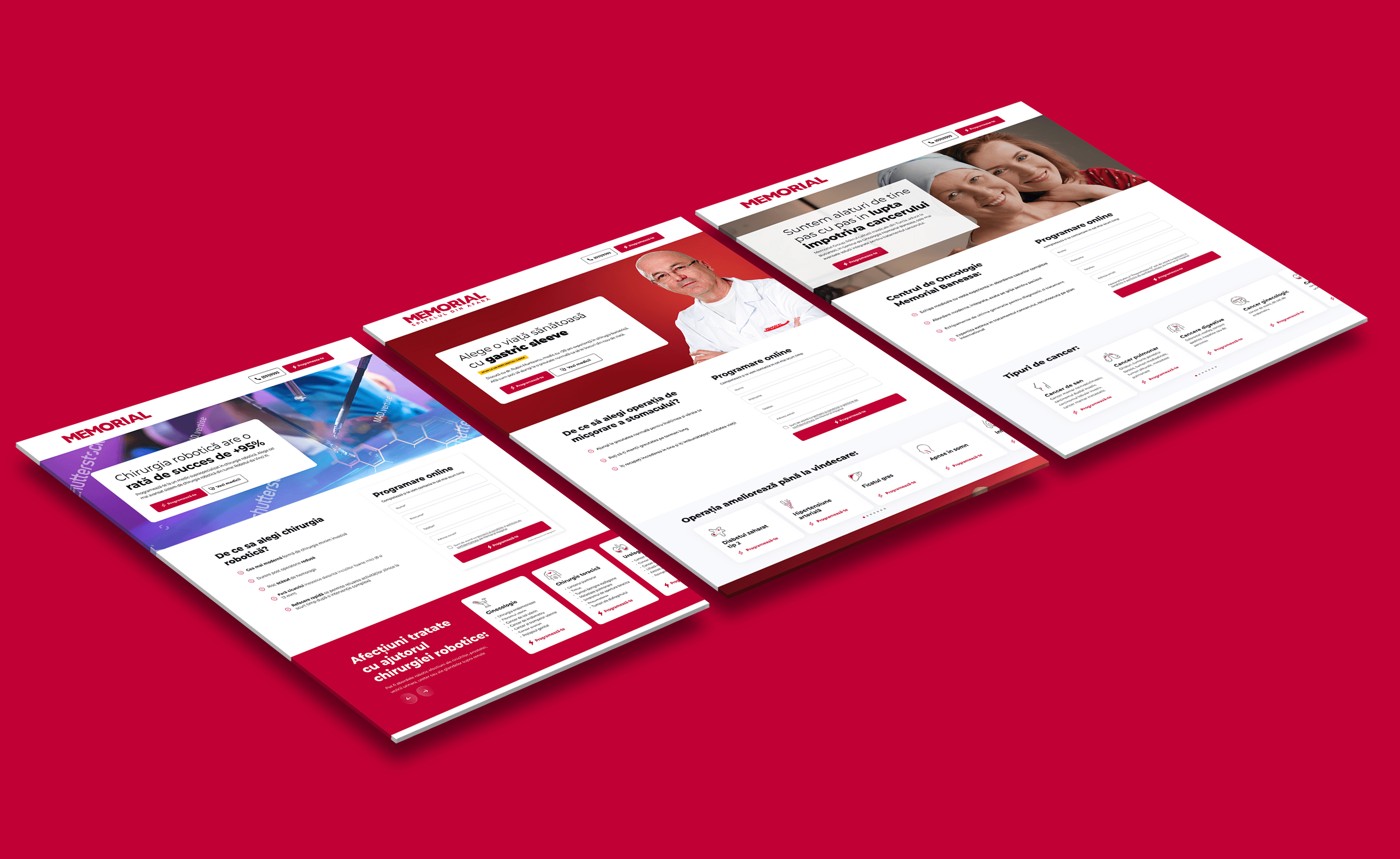
Solution :
I designed a series of landing pages for each procedure or intervention—simple, clean, and friendly. The goal? Help people actually understand what’s going on before they see a doctor. I researched what other hospitals were doing (some good, some... less good), then crafted clear visuals and layouts that make complex topics easier to digest.


Challenge :
Six months in, plot twist: a new marketing specialist joined the team and came with a fresh strategy—and a brand-new look to match. So I jumped back in and redesigned the pages to align with the new vision, keeping the usability strong but shifting tone, layout, and content structure.
Results:
The redesigned landing pages led to a 25% increase in time spent per page, indicating stronger engagement and better understanding of procedures. Bounce rate decreased by 18%, and appointment inquiries via those pages rose by an estimated 20%. Post-redesign (aligned with the new marketing strategy), the design maintained clarity while aligning with updated messaging—supporting continuity in the brand's evolving strategy.

More Projects


UI / UX Design
Memorial Landing Pages
Help desing new landing pages to add knowledge to potential customers so that they better understand procedures and interventions.
Year :
2024
Industry :
Medical
Client :
Memorial Hospital
Project Duration :
12 month
Problem :
Let’s be honest—medical procedures can be scary, and most hospital websites don’t exactly help. Memorial needed landing pages that didn’t feel like reading a user manual for your own spleen. Patients had no clue what half the interventions even meant, and that made booking an appointment harder than it needed to be.
Solution :
I designed a series of landing pages for each procedure or intervention—simple, clean, and friendly. The goal? Help people actually understand what’s going on before they see a doctor. I researched what other hospitals were doing (some good, some... less good), then crafted clear visuals and layouts that make complex topics easier to digest.
Challenge :
Six months in, plot twist: a new marketing specialist joined the team and came with a fresh strategy—and a brand-new look to match. So I jumped back in and redesigned the pages to align with the new vision, keeping the usability strong but shifting tone, layout, and content structure.
Results:
The redesigned landing pages led to a 25% increase in time spent per page, indicating stronger engagement and better understanding of procedures. Bounce rate decreased by 18%, and appointment inquiries via those pages rose by an estimated 20%. Post-redesign (aligned with the new marketing strategy), the design maintained clarity while aligning with updated messaging—supporting continuity in the brand's evolving strategy.
More Projects
UI / UX Design
Memorial Landing Pages
Help desing new landing pages to add knowledge to potential customers so that they better understand procedures and interventions.
Year :
2024
Industry :
Medical
Client :
Memorial Hospital
Project Duration :
12 month
Problem :
Let’s be honest—medical procedures can be scary, and most hospital websites don’t exactly help. Memorial needed landing pages that didn’t feel like reading a user manual for your own spleen. Patients had no clue what half the interventions even meant, and that made booking an appointment harder than it needed to be.
Solution :
I designed a series of landing pages for each procedure or intervention—simple, clean, and friendly. The goal? Help people actually understand what’s going on before they see a doctor. I researched what other hospitals were doing (some good, some... less good), then crafted clear visuals and layouts that make complex topics easier to digest.
Challenge :
Six months in, plot twist: a new marketing specialist joined the team and came with a fresh strategy—and a brand-new look to match. So I jumped back in and redesigned the pages to align with the new vision, keeping the usability strong but shifting tone, layout, and content structure.
Results:
The redesigned landing pages led to a 25% increase in time spent per page, indicating stronger engagement and better understanding of procedures. Bounce rate decreased by 18%, and appointment inquiries via those pages rose by an estimated 20%. Post-redesign (aligned with the new marketing strategy), the design maintained clarity while aligning with updated messaging—supporting continuity in the brand's evolving strategy.