Graphic Design
Episcopiei Font
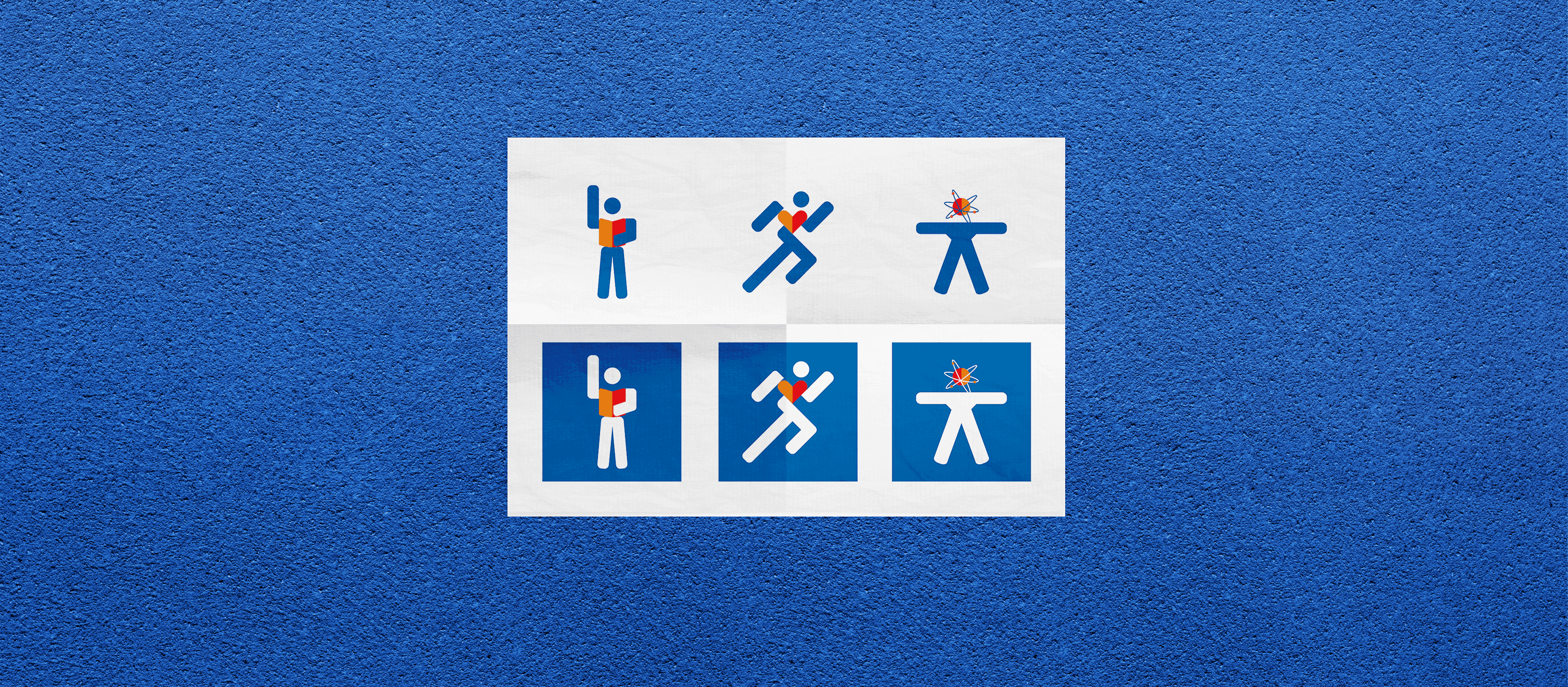
Episcopiei is a custom all-caps display font I designed for a brochure promoting the renovation of a historic building. Inspired by the elegant marble engraving on its façade, I turned forgotten stone glyphs into digital letters. A personal passion project disguised as client work.
Year :
2019
Industry :
Commerce
Client :
Skin Media
Project Duration :
2 weeks

Problem :
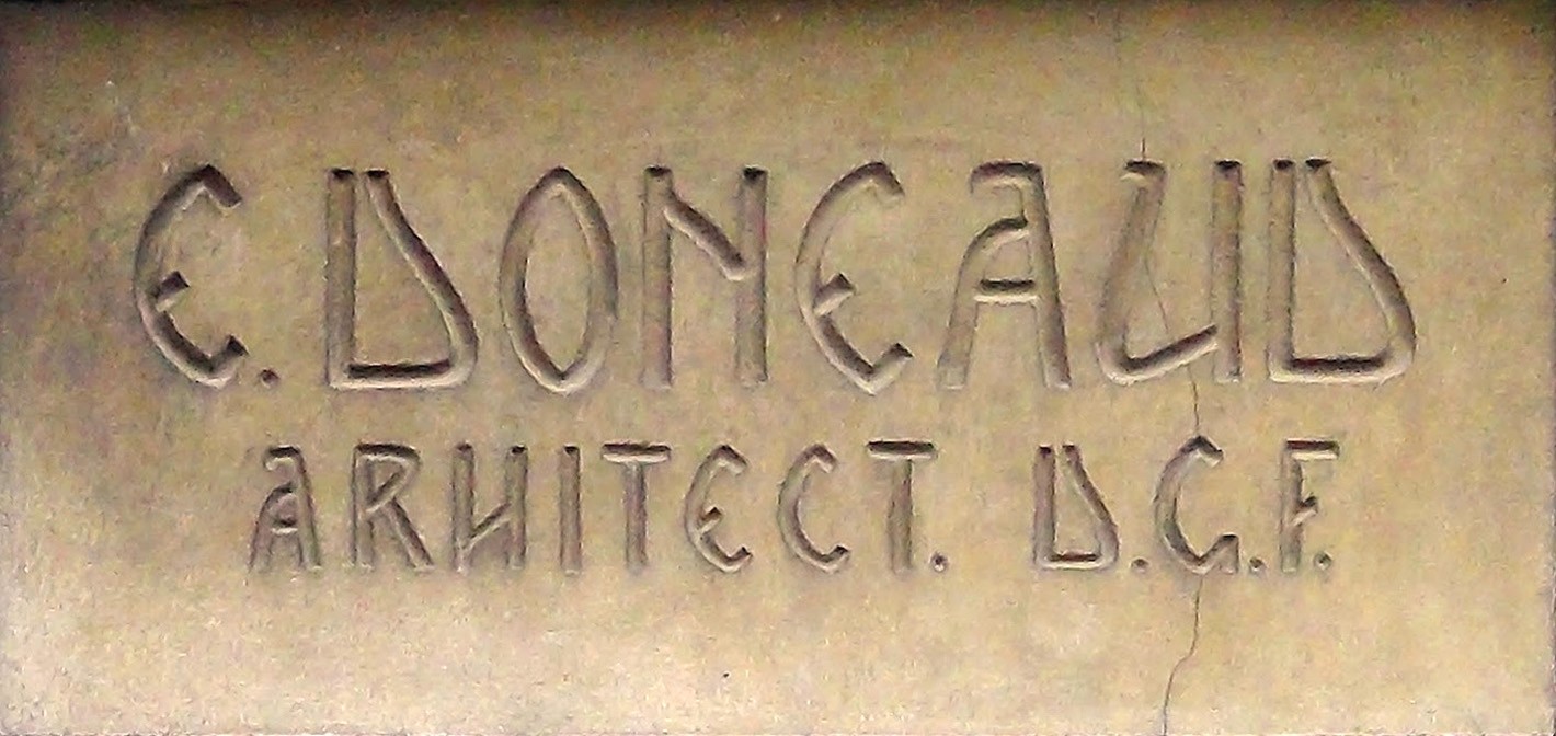
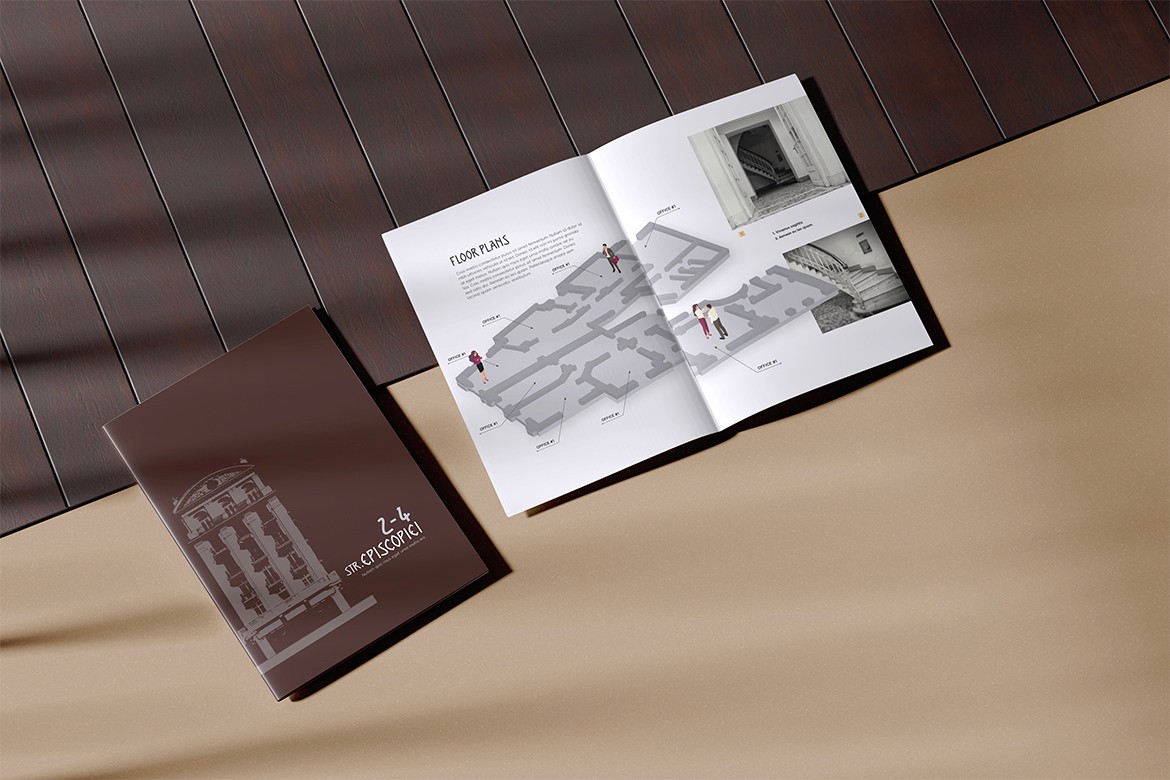
The job? A simple brochure for a beautifully aging building under renovation. But once I saw that marble inscription at the entrance—with its elegant, forgotten type—I knew the brochure deserved more than just any font. It needed that font.
Solution :
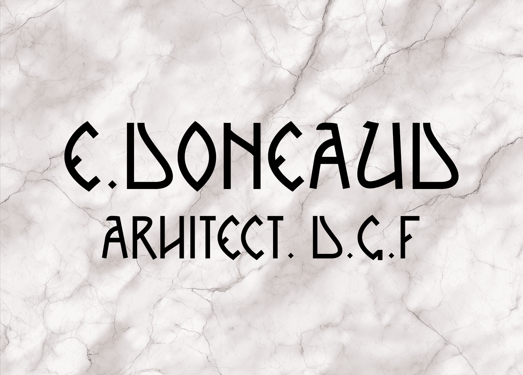
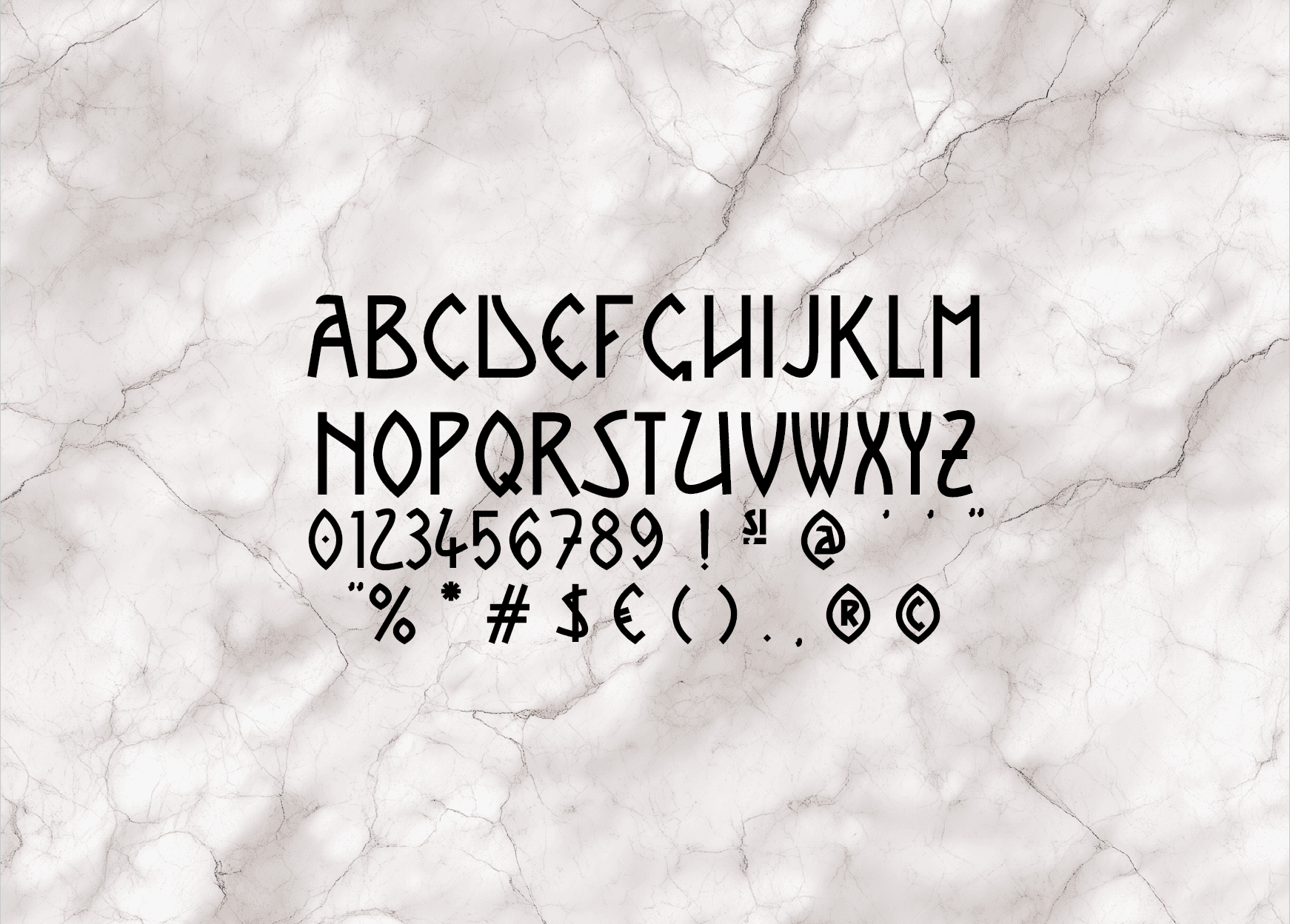
I recreated the engraved lettering from the marble slab into a custom font: Episcopiei. Just an all-caps set with numbers and punctuation—enough for titles, subtitles, and page numbers. It brought the entire brochure to life and gave the project a unique, authentic voice.
Challenge :
Making the font was the fun part. Convincing the client that “hey, I made a custom typeface just for this” wasn’t a detour—it was a feature—that was the tricky bit. Luckily, once they saw it in layout, they got it.
Summary :
Episcopiei was a design detour that became the main road. A typeface born from carved stone, translated into pixels, and used to give a brochure the dignity and elegance the building deserved. Bonus: I finally got to make a font. Designer bucket list item: ✅
More Projects


Graphic Design
Episcopiei Font
Episcopiei is a custom all-caps display font I designed for a brochure promoting the renovation of a historic building. Inspired by the elegant marble engraving on its façade, I turned forgotten stone glyphs into digital letters. A personal passion project disguised as client work.
Year :
2019
Industry :
Commerce
Client :
Skin Media
Project Duration :
2 weeks
Problem :
The job? A simple brochure for a beautifully aging building under renovation. But once I saw that marble inscription at the entrance—with its elegant, forgotten type—I knew the brochure deserved more than just any font. It needed that font.
Solution :
I recreated the engraved lettering from the marble slab into a custom font: Episcopiei. Just an all-caps set with numbers and punctuation—enough for titles, subtitles, and page numbers. It brought the entire brochure to life and gave the project a unique, authentic voice.
Challenge :
Making the font was the fun part. Convincing the client that “hey, I made a custom typeface just for this” wasn’t a detour—it was a feature—that was the tricky bit. Luckily, once they saw it in layout, they got it.
Summary :
Episcopiei was a design detour that became the main road. A typeface born from carved stone, translated into pixels, and used to give a brochure the dignity and elegance the building deserved. Bonus: I finally got to make a font. Designer bucket list item: ✅
More Projects
Graphic Design
Episcopiei Font
Episcopiei is a custom all-caps display font I designed for a brochure promoting the renovation of a historic building. Inspired by the elegant marble engraving on its façade, I turned forgotten stone glyphs into digital letters. A personal passion project disguised as client work.
Year :
2019
Industry :
Commerce
Client :
Skin Media
Project Duration :
2 weeks
Problem :
The job? A simple brochure for a beautifully aging building under renovation. But once I saw that marble inscription at the entrance—with its elegant, forgotten type—I knew the brochure deserved more than just any font. It needed that font.
Solution :
I recreated the engraved lettering from the marble slab into a custom font: Episcopiei. Just an all-caps set with numbers and punctuation—enough for titles, subtitles, and page numbers. It brought the entire brochure to life and gave the project a unique, authentic voice.
Challenge :
Making the font was the fun part. Convincing the client that “hey, I made a custom typeface just for this” wasn’t a detour—it was a feature—that was the tricky bit. Luckily, once they saw it in layout, they got it.
Summary :
Episcopiei was a design detour that became the main road. A typeface born from carved stone, translated into pixels, and used to give a brochure the dignity and elegance the building deserved. Bonus: I finally got to make a font. Designer bucket list item: ✅