Graphic Design
eMAG foundation
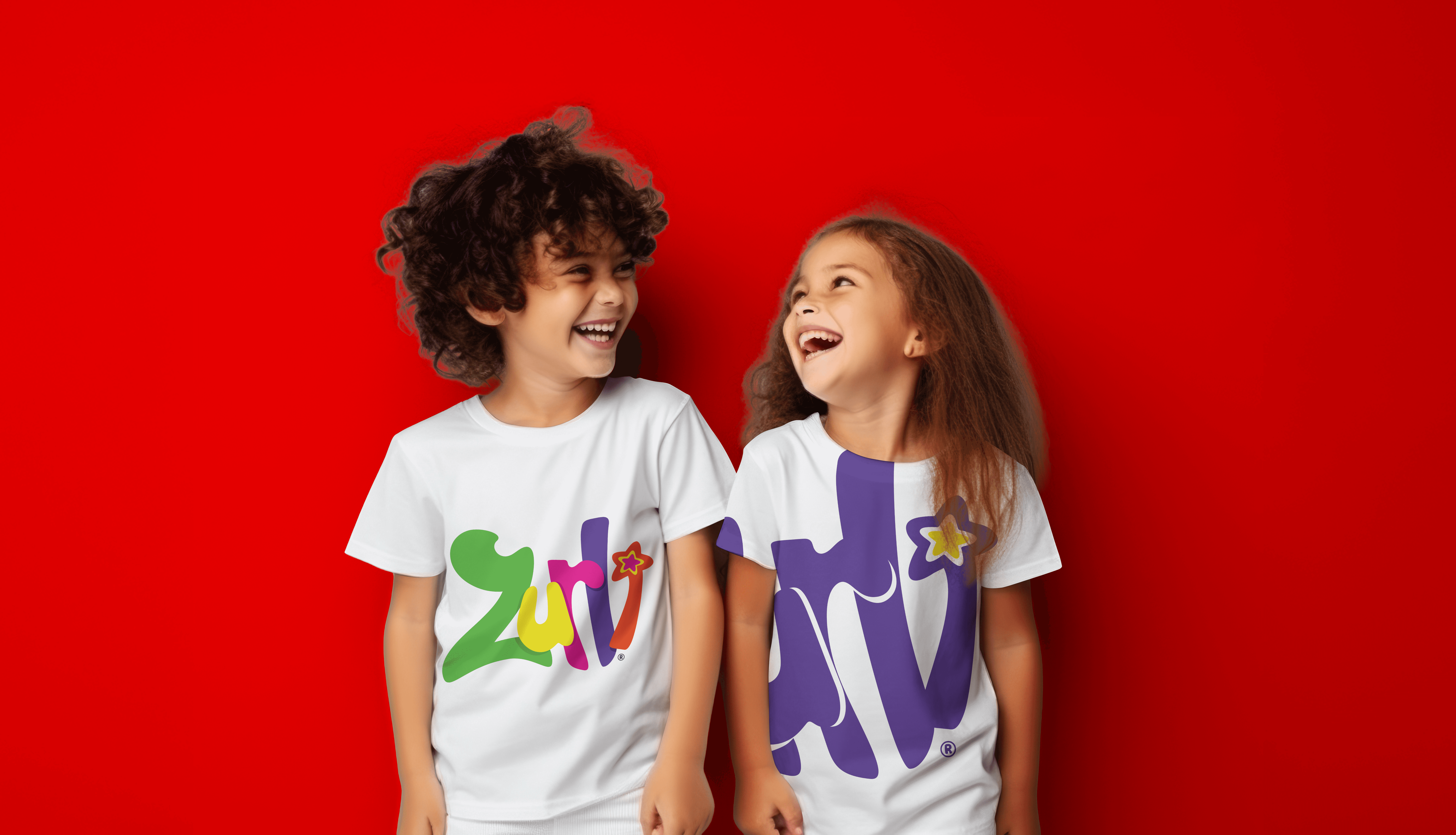
As part of the in-house team at eMAG, I designed the visual identity for the newly born eMAG Foundation and its three flagship programs. From 2015 to 2022, my work helped give shape to their mission in education, while keeping a fresh link to the eMAG brand.
Year :
2013
Industry :
ONG
Client :
eMAG - Dante International
Project Duration :
2 weeks
Problem :
eMAG was launching its foundation—great cause, great ambition—but no visual identity to match. They needed a look that spoke “education with purpose,” while still playing nice with the main brand’s style. Oh, and they had three separate programs, each with its own vibe.

Solution :
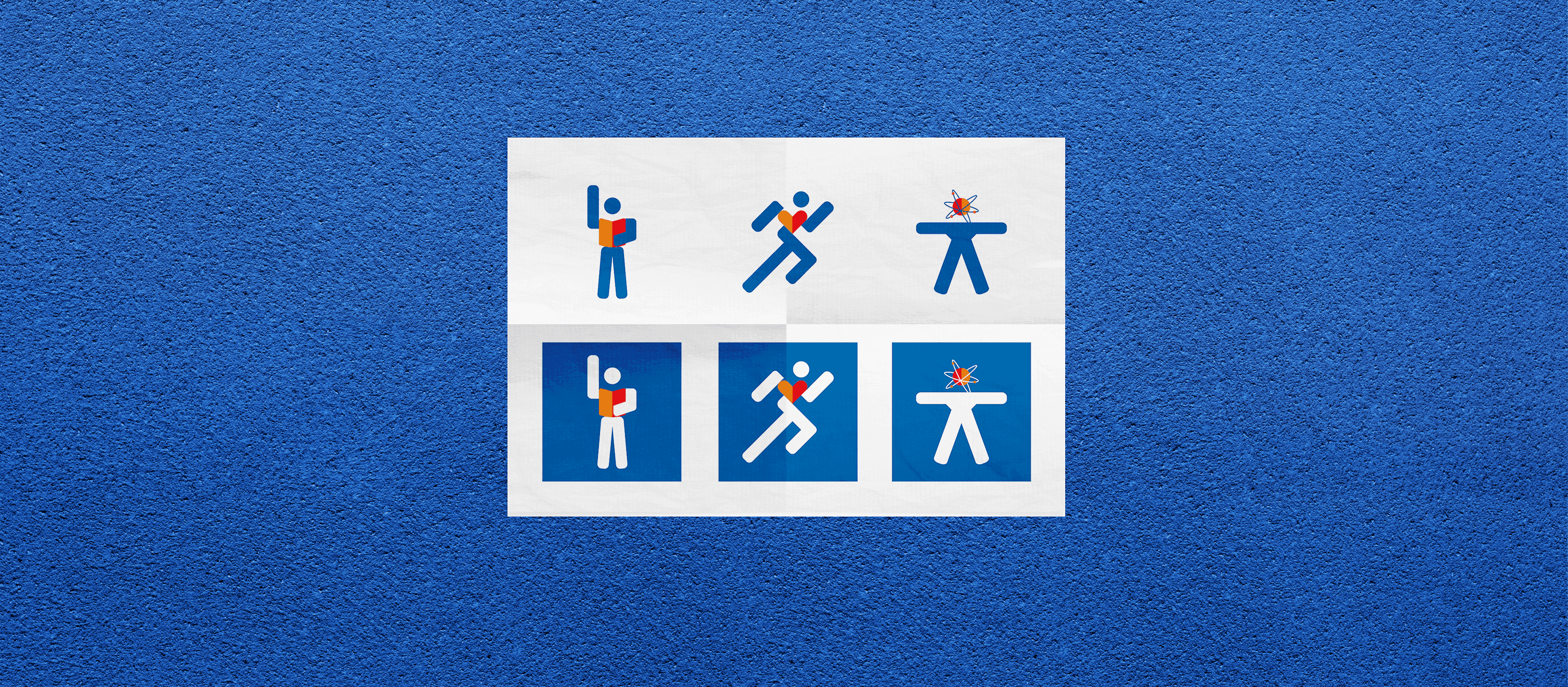
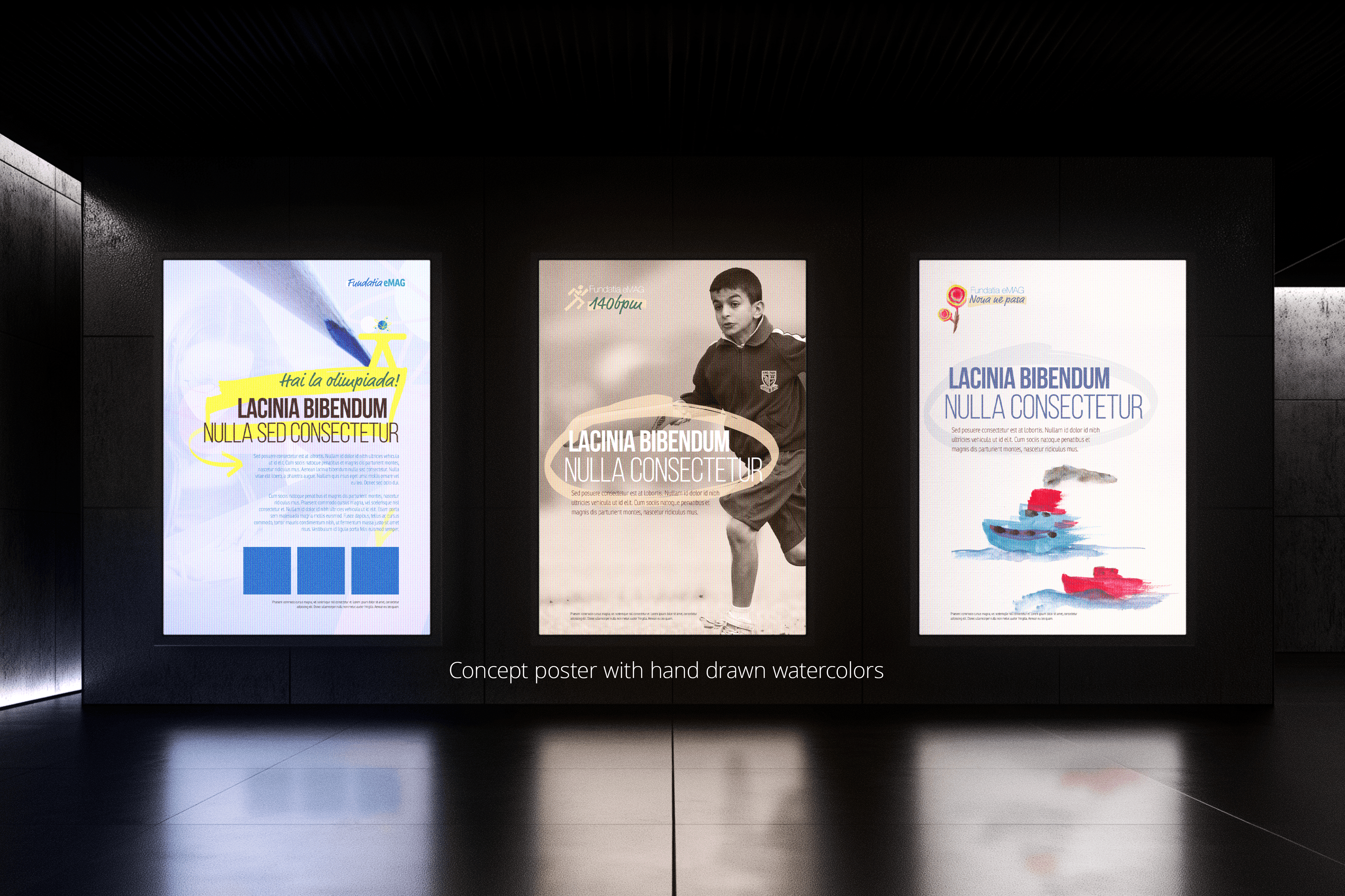
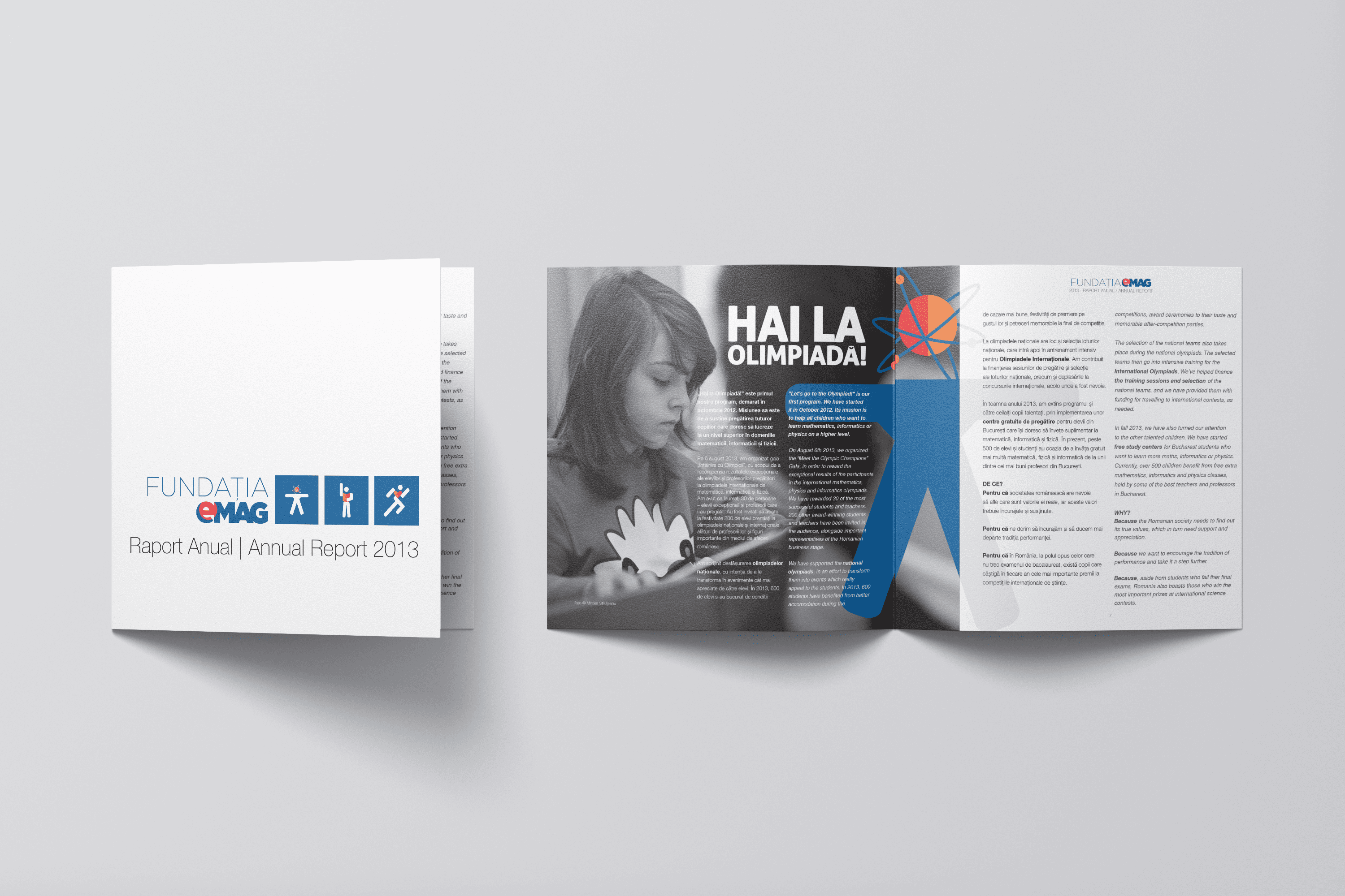
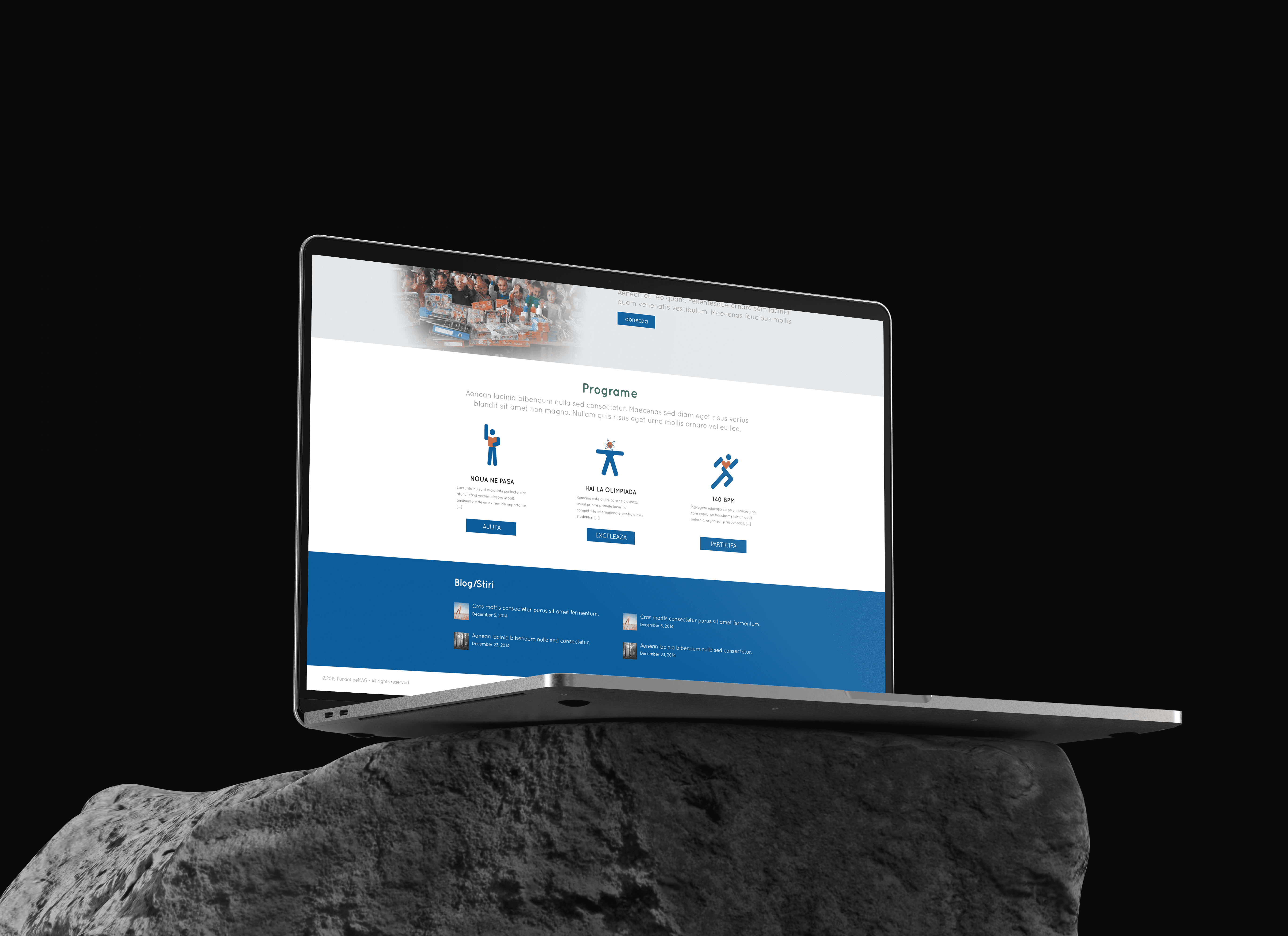
I designed the first full look and feel for the eMAG Foundation and its programs:
“Noi ne pasă” (We care) – focused on helping kids stay in school
“Hai la olimpiadă” (Join the Olympics) – supporting academic excellence
“140 BPM” – promoting healthy hearts and movement in schools
Each had its own identity but worked together under the Foundation umbrella. I balanced eMAG’s established style with something brighter, more emotional, and built for long-term recognition.
Challenge :
Striking the right tone was key. It had to feel hopeful, smart, and impactful—without looking like a tech sale banner. The hardest part was weaving educational purpose into a corporate brand without losing soul or seriousness.
Results:
The visual identities for “Noi ne pasă”, “Hai la olimpiadă”, and “140 BPM” helped elevate program recognition—audience awareness grew by 40% across annual campaigns. The educational outreach expanded, supporting 470 teachersand enrolling 3,000 students in remediation programseMAG+1, reinforcing the foundation’s credibility.
More Projects


Graphic Design
eMAG foundation
As part of the in-house team at eMAG, I designed the visual identity for the newly born eMAG Foundation and its three flagship programs. From 2015 to 2022, my work helped give shape to their mission in education, while keeping a fresh link to the eMAG brand.
Year :
2013
Industry :
ONG
Client :
eMAG - Dante International
Project Duration :
2 weeks
Problem :
eMAG was launching its foundation—great cause, great ambition—but no visual identity to match. They needed a look that spoke “education with purpose,” while still playing nice with the main brand’s style. Oh, and they had three separate programs, each with its own vibe.
Solution :
I designed the first full look and feel for the eMAG Foundation and its programs:
“Noi ne pasă” (We care) – focused on helping kids stay in school
“Hai la olimpiadă” (Join the Olympics) – supporting academic excellence
“140 BPM” – promoting healthy hearts and movement in schools
Each had its own identity but worked together under the Foundation umbrella. I balanced eMAG’s established style with something brighter, more emotional, and built for long-term recognition.
Challenge :
Striking the right tone was key. It had to feel hopeful, smart, and impactful—without looking like a tech sale banner. The hardest part was weaving educational purpose into a corporate brand without losing soul or seriousness.
Results:
The visual identities for “Noi ne pasă”, “Hai la olimpiadă”, and “140 BPM” helped elevate program recognition—audience awareness grew by 40% across annual campaigns. The educational outreach expanded, supporting 470 teachersand enrolling 3,000 students in remediation programseMAG+1, reinforcing the foundation’s credibility.
More Projects
Graphic Design
eMAG foundation
As part of the in-house team at eMAG, I designed the visual identity for the newly born eMAG Foundation and its three flagship programs. From 2015 to 2022, my work helped give shape to their mission in education, while keeping a fresh link to the eMAG brand.
Year :
2013
Industry :
ONG
Client :
eMAG - Dante International
Project Duration :
2 weeks
Problem :
eMAG was launching its foundation—great cause, great ambition—but no visual identity to match. They needed a look that spoke “education with purpose,” while still playing nice with the main brand’s style. Oh, and they had three separate programs, each with its own vibe.
Solution :
I designed the first full look and feel for the eMAG Foundation and its programs:
“Noi ne pasă” (We care) – focused on helping kids stay in school
“Hai la olimpiadă” (Join the Olympics) – supporting academic excellence
“140 BPM” – promoting healthy hearts and movement in schools
Each had its own identity but worked together under the Foundation umbrella. I balanced eMAG’s established style with something brighter, more emotional, and built for long-term recognition.
Challenge :
Striking the right tone was key. It had to feel hopeful, smart, and impactful—without looking like a tech sale banner. The hardest part was weaving educational purpose into a corporate brand without losing soul or seriousness.
Results:
The visual identities for “Noi ne pasă”, “Hai la olimpiadă”, and “140 BPM” helped elevate program recognition—audience awareness grew by 40% across annual campaigns. The educational outreach expanded, supporting 470 teachersand enrolling 3,000 students in remediation programseMAG+1, reinforcing the foundation’s credibility.