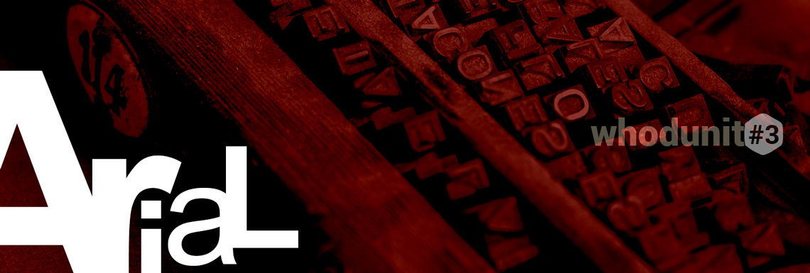
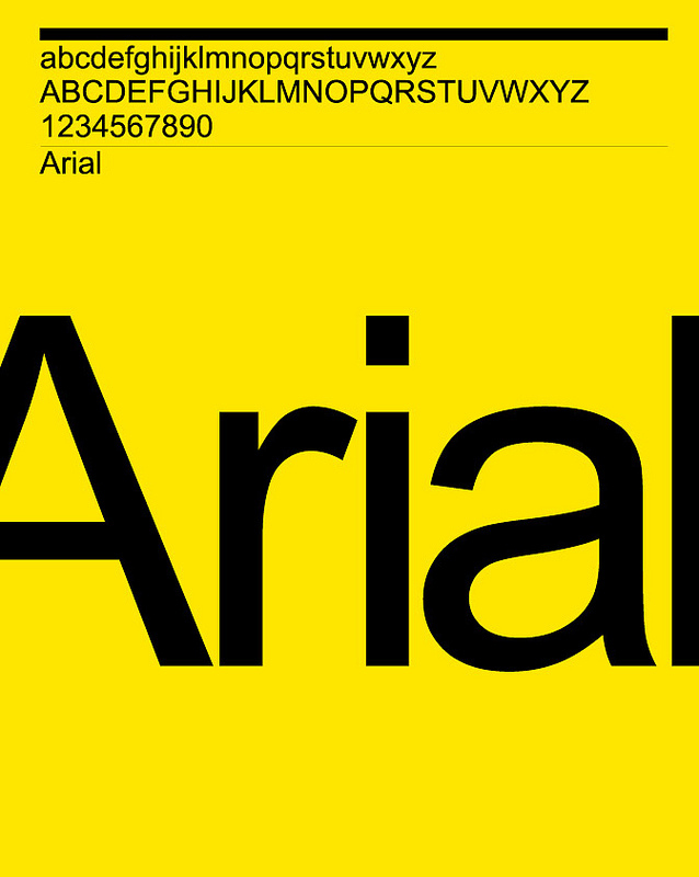
If you’re reading this, you’re either on a personal computer, on a tablet or on a smart phone. If you’re reading this there is a great chance that you are reading it using this absolutely common and widely spread font. But how many of you do know it’s creator and how it got to be on your device. Who is Arial?
Back in ’82, this legendary foundry that is Monotype (we’ll get to it at some point because they have been on the forefront of typefaces for a long time) being under contract with IBM to supply some new printers that they have released that year, developed the font Arial using a 10-person team coordinated by Robin Nicholas and Patricia Saunders. But the story doesn’t end here. IBM marketed this font as Sonoran Sans Serif due to some licensing restrictions. And after adding new styles and weights and language support for it, Microsoft, in 1992 introduced Arial as one of the four core TrueType fonts for Windows 3.1. They announced it as an “alternative to Helvetica”. Rumour has it that they didn’t wanted to pay the licensing fees for Helvetica but in fact, according to Allan Haley (Monotype director) “the amount of money Microsoft paid over the years for the development of Arial could finance a small country”
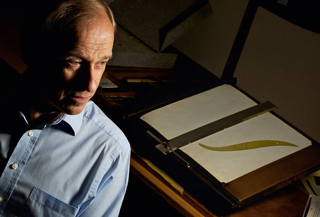
Now, who are Mr. Nicholas and Mrs. Saunders? Both of them are Monotype employees and both have designed, over the years, numerous well-known fonts. Among them, Mrs Saunders, can be proud of no other than Monotype Corsiva – yes, if you look around you, there’s got to be at least a business card or a logo or a restaurant menu using this font. It’s one of the fonts that your computers gives you by default and I believe it’s the only one that looks like calligraphy. I can even hear a client say “Please put my signature in this font I found – Corsiva or something.”
“I don’t see myself as a typeface designer. Hermann Zapf is a typeface designer. What I have done is to develop typefaces: pulling component parts of various typefaces that seem to work well and amalgamate those into a new design.”Robin Nicholas
In the end even if he grew in the shadow of Helvetica, Arial, had the advantage of a widely spread OS and out run it’s nemesis being used by default in far more cases. But that doesn’t mean that Helvetica will not have it’s story here someday.